Chapter 3-16: Using GUI Features of the Image Editor |
Window Options
Window Options apply to all images and contain the following items:
Border identifies the border style for the frame or image. Click the list Border Color indicates the color of the border. You can enter a specific color name or click the color selection icon to make the color selection. See the Making Color Selections section for more details.
Wallpaper Tiling Mode indicates where on the screen the wallpaper should be placed when it overlays another image. Click the list TILE to tile the wallpaper graphic to fill the menu or input image. EXPAND to expand or shrink the wallpaper graphic to fit the menu or input image. CENTER to center the wallpaper graphic within the menu or input image. TOP, RIGHT, BOTTOM, LEFT, UPPER RIGHT, UPPER LEFT, LOWER RIGHT, and LOWER LEFT position the wallpaper graphic at the specified point on the menu or input image.
Background Transparent? Indicates whether or not the background should be transparent when displayed. Click the checkbox to toggle between 'yes' Background Color indicates the color of the background and is only applicable if you do not define a wallpaper in the Resource Field. If you define both a wallpaper and a background color, the wallpaper will hide the background color selected. The wallpaper overlays the background color so, if the wallpaper does not totally fill the image, then the background color will appear around the wallpaper. You can enter a specific color name or click the Color Selection icon to make the color selection. See the Making Color Selections section for more details. |
Application Design Manual "Powered by Appx Software"456 ©2006 By APPX Software, Inc. All Rights Reserved |
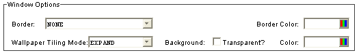
 button to view a list of choices.
 and 'no'
  .
.